Bratiska®
Bratiska®
Bratiska®
Letterings
Year
2019
Client
Bratiska®
I had the privilege of collaborating with Bratiska, a brand that celebrates regional pride and a love for one's roots. Their simple yet powerful concept involves using typography designs on t-shirts to represent the names of cities and places close to people's hearts, wherever they're from or wherever they were born.
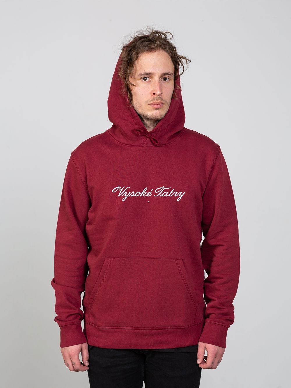
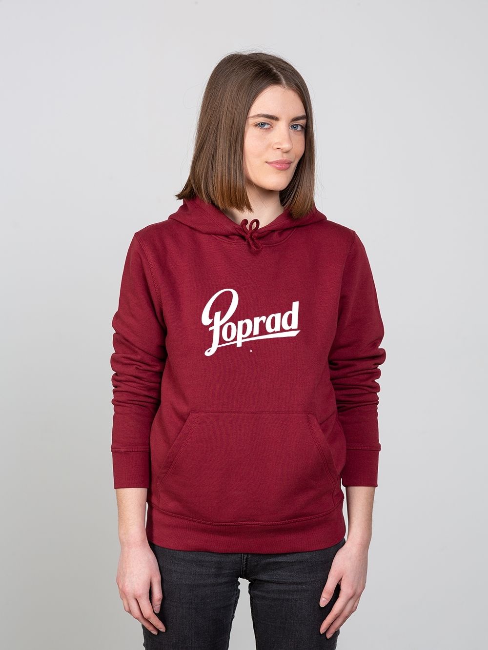
Bratiska approached me to create custom lettering for four cities: Vysoke Tatry, Poprad, Martin, and Banska Bystrica. To capture the essence of each place, I delved into research, seeking out designs that hold special meaning for the residents of these cities.
For Martin, I reimagined the iconic Fatra mineral water brand, giving it a fresh and unique twist. Vysoke Tatry drew inspiration from vintage 18th-century postcards, reflecting the rich history and natural beauty of the region. In the case of Poprad, I looked to old beer labels from the previous decade, infusing the city's spirit into the lettering.
The result was a set of custom lettering designs, each one a unique representation of the city it portrays. These designs offer a way for individuals to proudly showcase their connection to their hometowns or places of significance. This project was a creative journey that blended history, identity, and design, celebrating the richness of local cultures and the love people have for their roots.